
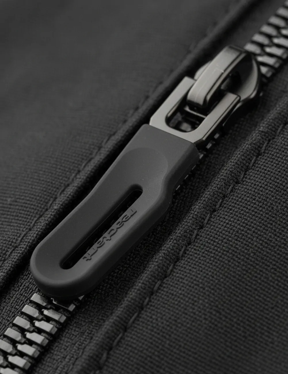
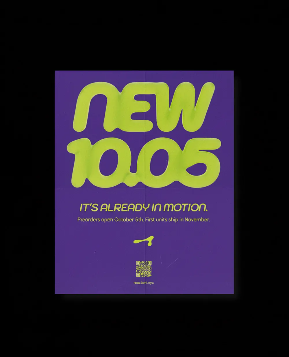


This project started before Reactant had a name. The founder came to us wanting to build a brand and products designed for movement, not fixed to one category or one way of carrying things. We built the brand identity around that idea from scratch.
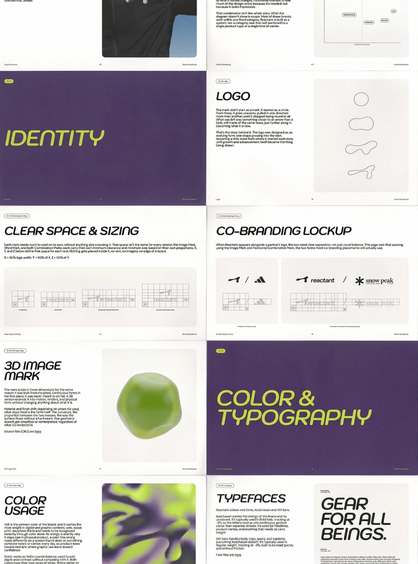
We partnered with Reactant to develop the identity from the ground up: brand strategy, the logo system, typography and color direction, and a living guidebook to hold it all together. Every decision traced back to one question: how do you build a brand that can grow into things it hasn’t done yet, without losing what makes it recognizable.
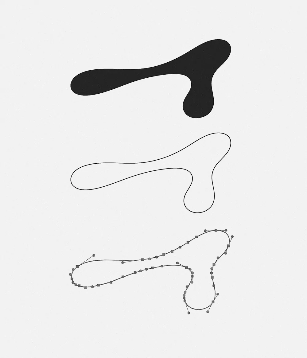
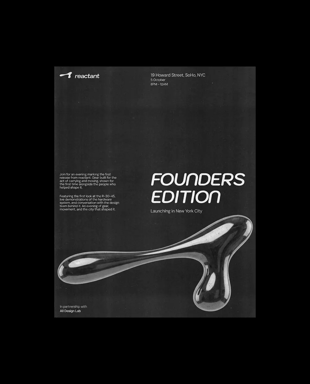
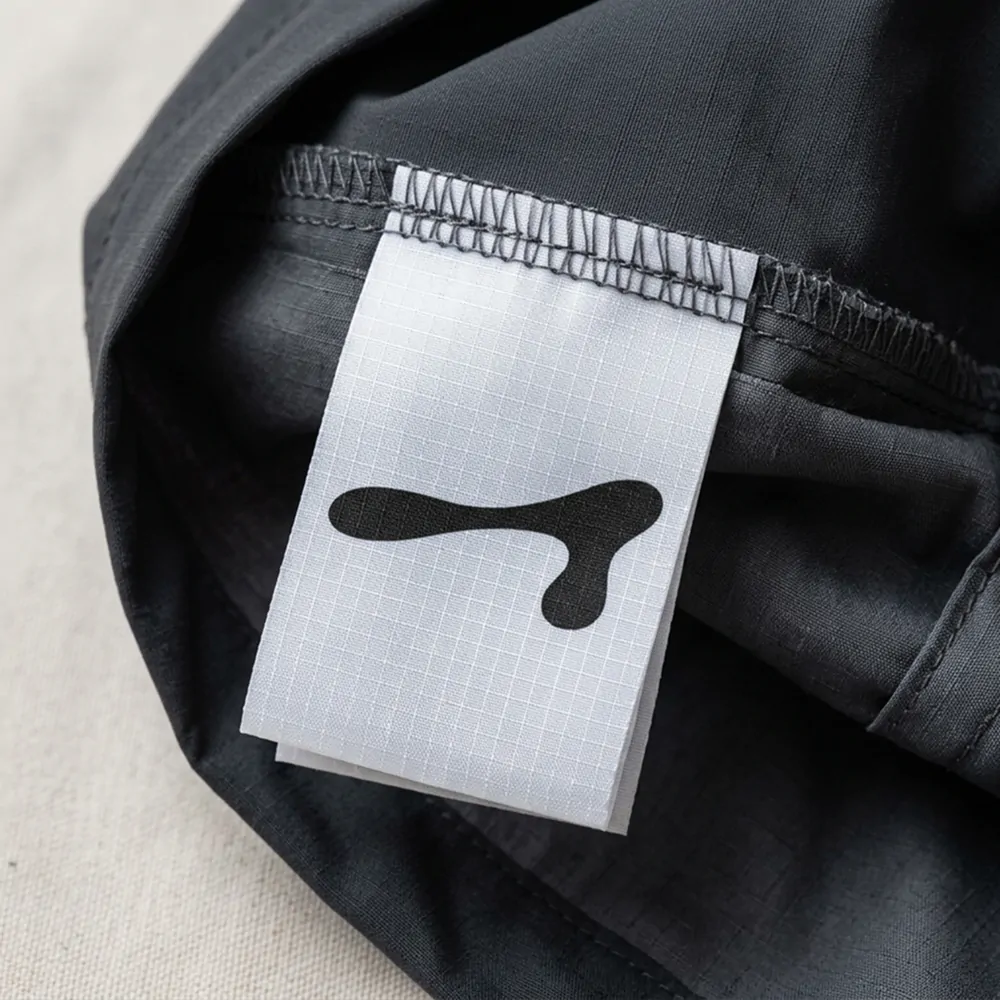
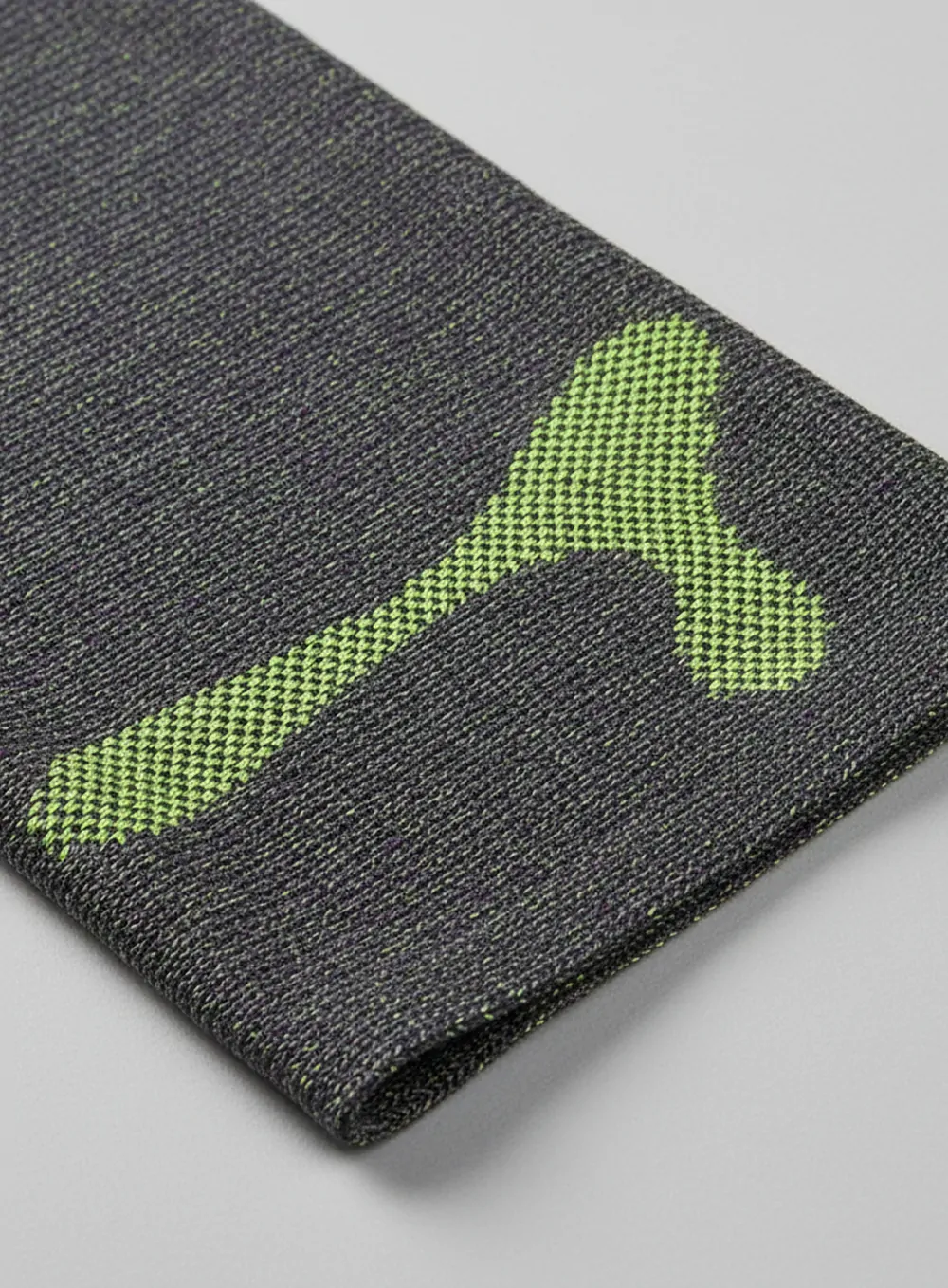
The mark at the center of it is built from a shifting, evolving shape, one form growing into the next rather than sitting fixed. That idea is the logic behind the name itself. Reactant is a brand designed to react, with a visual language built to evolve, flex, and grow alongside the world, the products, and the brand’s approach to both.
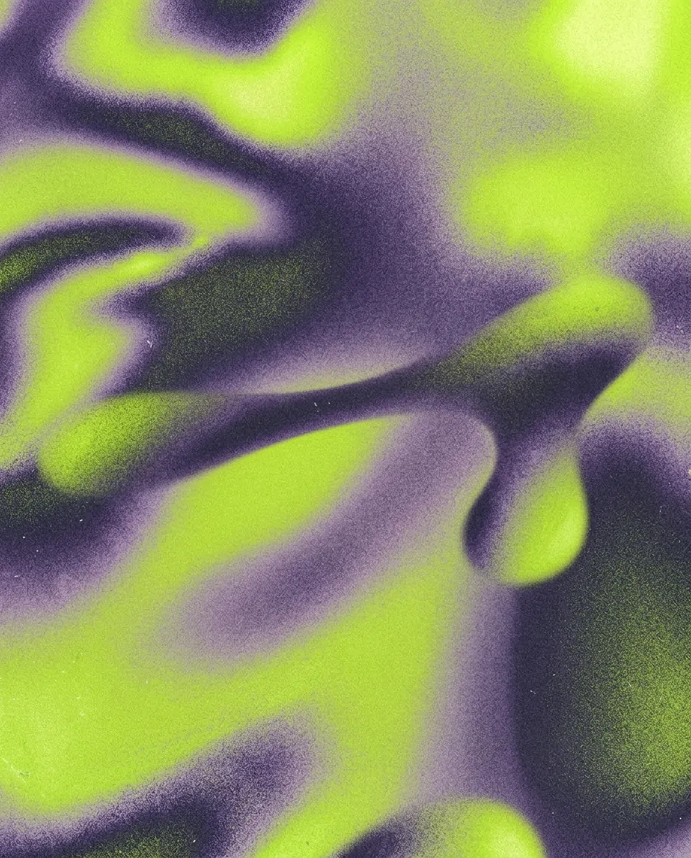
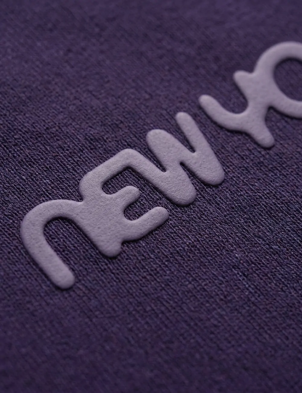
The typography, color palette, and guidebook structure all carry that same logic. Nothing in the system was meant to be locked in place. Instead, the identity gives Reactant room to expand as the brand does, whether that means new products, new categories, or directions the founder hasn’t defined yet.